Working or sleeping, I dream of graphs - usually of rather fancy graphs on academic journals. When I think how brilliant graphs impact my feelings, I wonder about the code behind, for I am extremely tired of, and frightened by making plots by hand in Origin Lab or some other software.
Updated 2021-01-25: change the color order in the mplstyle file.
Updated 2021-01-29: add a demo graph
Current status
Usually my workflow of creating academic graph is:
- Doing data analysis using python or some others
- Exporting result data to Excel files or CSV files
- Copying result data into Origin Lab and making some graphs
- Adjusting graph details endlessly
drawbacks of matplotlib
Someone may ask why not use matplotlib to make graphs, for this would avoid using other software. Sure, it is absolutely right. And I appreciate directly using matplotlib to create graphs much. The problem is, the default style of matplotlib is far from satisfactory. Lots of details need to be changed and below is an uncompleted list:
- The default font size are too small
- The default linewidth is too thin
- The default font family is somewhat ugly (depending on the system font, indeed)
- ......
drawbacks of Origin Lab software
I have to admit that Origin Lab is a wonderful graph software and quite easy to use for newbies and experts. It is quick to create a simple graph by clicking some buttons, and all operations can be done visually without any coding.
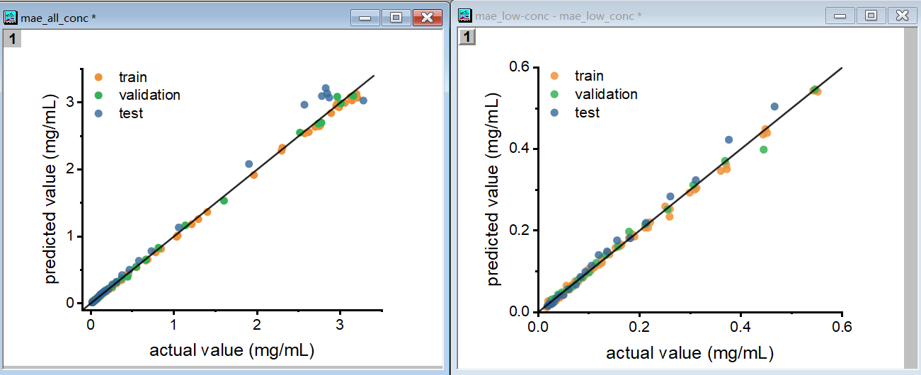
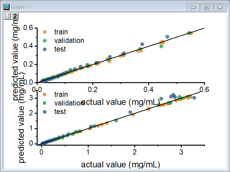
However, when creating some complex graphs, Origin's default settings are not good enough. For example, when creating multiple subplots (the term subplot is consistent with matplotlib's API), I usually choose the merge function to gather all the subplots into one graph. But aligning all the subplots would often be a mess even if the individual plots perform perfectly. It is somewhat confusing to make all subplots' sizes perfect. Below is an example. The biggest problem is the size doesn't fit and there are many other small issue.
Matplotlib style
It is certain that most elements of both Origin Lab graphs and matplotlib graphs can be optimized. The problem might be that you should be very familiar with them. As far as I know, the customized format style of Origin Lab and matplotlib can be saved for further use. But it seems not easy for Origin Lab to remember the alignment settings for multiple subplots, which exhausted my patience.
天下苦Origin久矣。
So, when I found the project SciencePlots, I feel like boarding Noah's Ark. This project contains several matplotlib style files which can be simply used by plt.style.use('scicence').
This project opens my mind and soon I modified the style file in order to meet my requirements. The usage of the style files is like ggtheme in ggplot2, which, I accidentally met some years ago.
Style configuration
Here I simply put my configuration file for some explanation.
# It is a modified version of garrettj403/SciencePlots/science.mplstyle
# (https://github.com/garrettj403/SciencePlots/blob/master/styles/science.mplstyle)

# Set color cycle: using vibrant palette, color-blind safe
axes.prop_cycle : cycler('color', ['EE7733', '0077BB', '009988', 'CC3311', '33BBEE', 'EE3377', 'BBBBBB'])

# Set default figure size
figure.figsize : 8, 6

# Set font size
# Large font size helps clear vision when the graph is zoomed out
font.size: 24
legend.fontsize: 22
axes.labelsize: 24
axes.titlesize: 24
xtick.labelsize: 24
ytick.labelsize: 24
axes.titlepad: 10

# Set x axis
# large ticks are also needed
xtick.direction : in
xtick.major.size : 6
xtick.major.width : 1.5
xtick.minor.size : 4
xtick.minor.width : 1
xtick.minor.visible : True
xtick.top : True

# Set y axis
ytick.direction : in
ytick.major.size : 6
ytick.major.width : 1.5
ytick.minor.size : 4
ytick.minor.width : 1
ytick.minor.visible : True
ytick.right : True

# Set line widths
# think linewidth and big scatter points are also needed
axes.linewidth : 2
grid.linewidth : 1
lines.linewidth : 3
lines.markersize : 10
axes.grid : False

# Remove legend frame
legend.frameon : False

# Always save as 'tight'
savefig.bbox : tight
savefig.pad_inches : 0.05


# Use sans-serif fonts
# Times New Roman or Arial are for serif and sans, respectively
# If CJK characters are necessary, change font-family to Microsoft Yahei
font.sans-serif : Arial
font.serif: Times New Roman
font.family : sans-serif
mathtext.fontset : stix
# for CJK
 # please be sure that YaHei is correctly spelled instead of Yahei
font.sans-serif : Microsoft YaHei
font.family: sans-serif
mathtext.fontset : dejavuserif
axes.unicode_minus: False
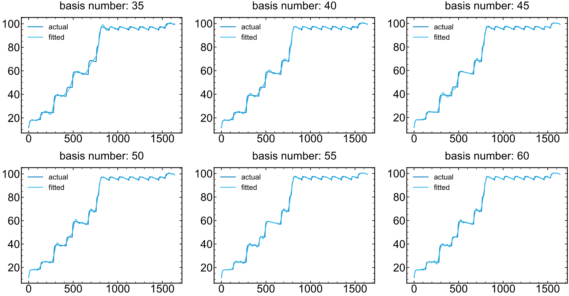
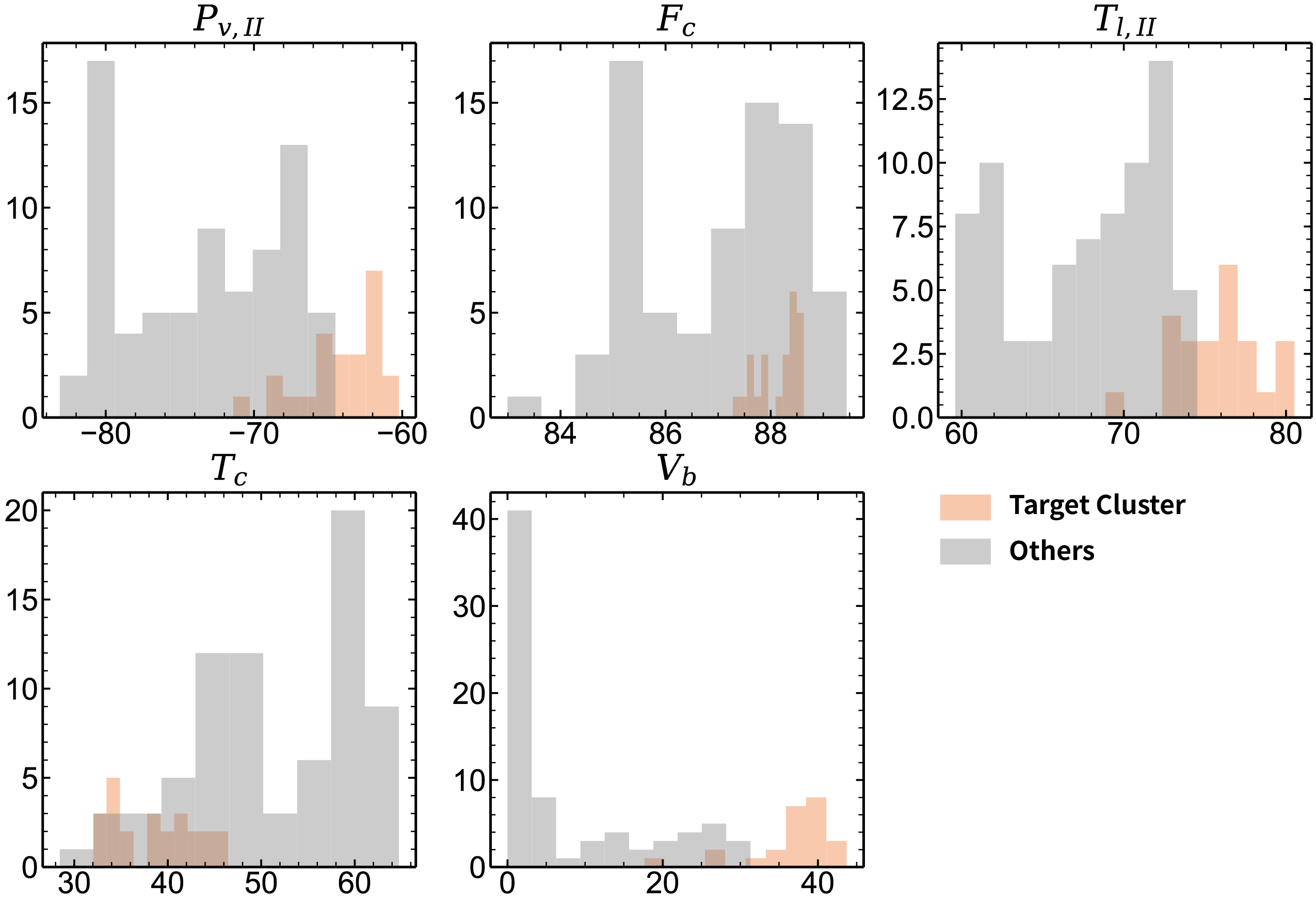
demo graphs
More pictures and codes can be found on my notes